Viewing entries in
HD Projectors

Five Ways to Maximize Your Event Branding

Five Ways to Maximize Your Event Branding

With all of the time that you spend creating a strong brand for your company or organization, you don't want to miss an opportunity to leverage your brand identity and spread your message. Events often provide the perfect platform for driving that message home both verbally and visually! Here are a few ways that you can infuse your team's mission statement into your next event.

#1: Custom Panel Decor
Custom Designed Komatex Panels

One way to bring your logo to life is with our custom laser-cut modular panels. Available in multiple sizes, these panels take light beautifully and can be combined with our translucent acrylic panels to create a sleek backdrop for your event!

#2: Custom Gobos
Custom Gobo Virginia Film Festival

Another way to show off your logo is with custom gobos! Gobos allow us to blast your logo onto virtually any surface, making them a fun addition to a party-type atmosphere. (Photo by Amanda Maglione)

#3: Projection
Virginia Film Festival Projection Mapping
Projection Mapping Darden

Projection allows us to transform surfaces to your benefit, making your branding feel less like a set piece and more like an integral part of the space! Whether projecting onto the walls of the Jefferson Theater or on a spandex tent divider, this is an elegant way to incorporate your brand identity into an environment. (Top photo by Tom Daly)

#4: Marquee Letters
Custom Marquee Letters Paris Graphics
Custom Marquee Letters Paris

One fun and trendy way of branding your event is with marquee letters! We know you've seen them in smaller sizes, but our 9-foot tall custom marquee letters add impact and charm to any event decor scheme.

#5: Unique Screen Configurations
Absen LED Video Wall Panels
LED Video Screen Panels for Virginia Film Festival

Our new 2-foot Absen LED panels can be configured into different sizes and shapes of screens, giving you the flexibility to design new and interesting layouts for digital signage! Our LED panels are always a stunning addition to any event, providing the highest quality image and allowing you to add visual interest to the layout of your branding graphics.
One Element That Can Give Your Event a Boost

One Element That Can Give Your Event a Boost

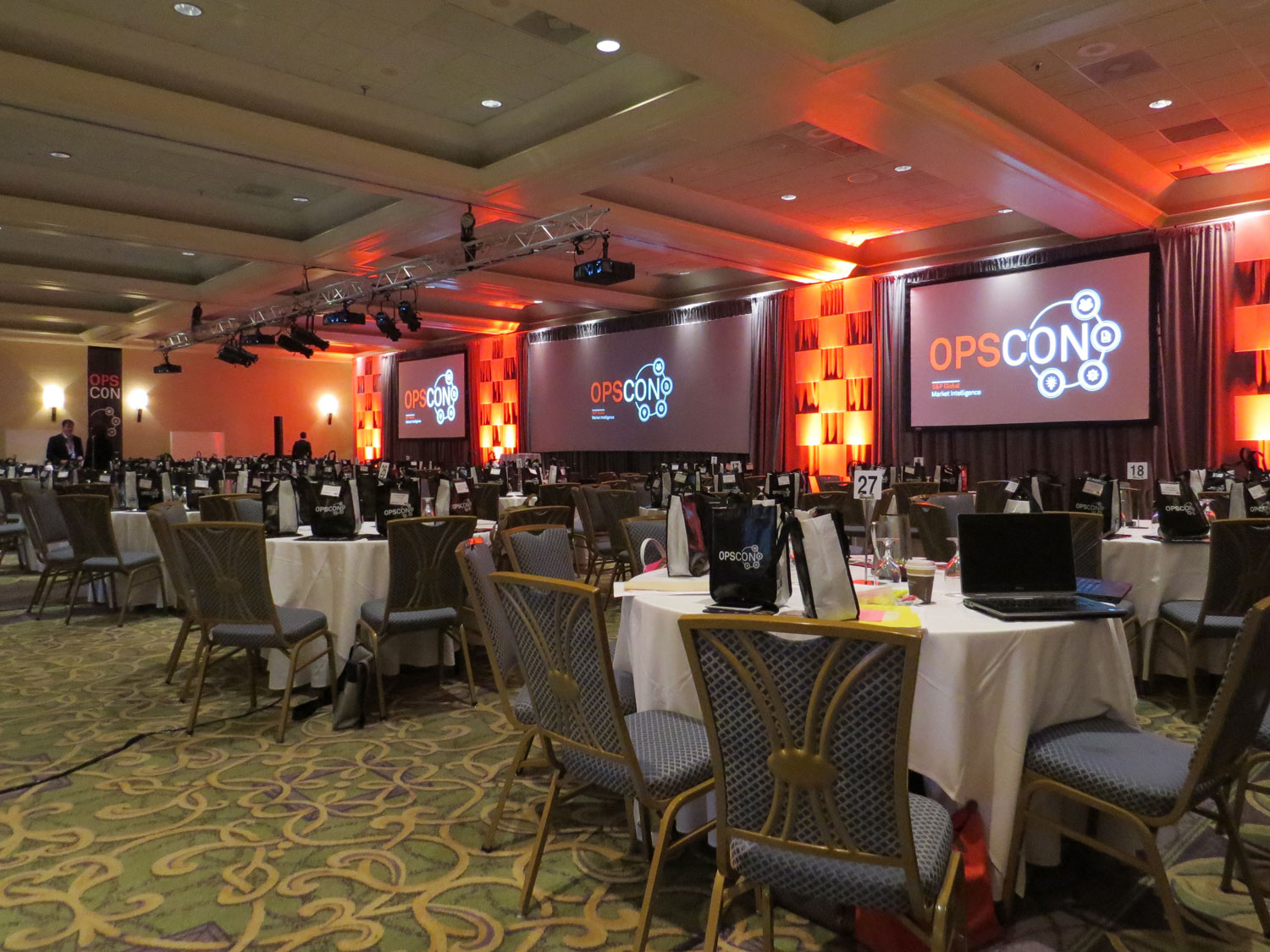
When planning a conference or meeting, it's easy to focus on screen sizes, uplighting, fabric colors, and table decor. But there may be an element you're overlooking that can make a huge aesthetic impact: event graphics.

As a rule of thumb, even during downtime between presentations, it is best to have ambient graphics to populate all screens. Blank screens leave a set looking incomplete, and graphics provide a great opportunity to wow your attendees from the moment they enter the event space!

snl-conference-event-graphics.jpg

Strong graphics allow the screens to become an active part of your set. The graphics can be used to tie into & strengthen other elements of the event, maximize your branding, drive home your message, and sometimes even entertain your audience!

randolphmacon-event-graphics.jpg
tedx-decor-event-graphics.jpg
devcon-projection-screen-event-graphics.jpg


As seen in the examples below, sometimes graphics can even provide a full backdrop for your speakers! Using projected graphics instead of physical signage gives you the flexibility to change up your look throughout the event, or add motion graphics to make the set more dynamic.

tedxcharlottesville-projection-eventgraphics.jpg
celebrationofchampions-uva-event-graphics.jpg
tedxcharlottesville-projection-eventgraphics2.jpg

If you need assistance in creating graphics for your event, we would be happy to help!

Head on over to our contact page and give us a shout to get started!

Ten Powerpoint Tips

Ten Powerpoint Tips

Summer is in full swing, and we are starting to plan for our fall conferences! For those of you working on your own conferences and meetings, we thought we might put together a few pointers for constructing great presentation visuals.

We've compiled a list of Ten PowerPoint Tips to assist you when putting together your next presentation!  Here's a sneak peek...

Use a 16:9 aspect ratio to completely fill the screen. In versions of Powerpoint prior to 2013, the default is set to a Standard 4:3 ratio. If you need assistance in reformatting your slides to a 16:9 ratio, give us a call and we would be happy to h…

Use a 16:9 aspect ratio to completely fill the screen. In versions of PowerPoint prior to 2013, the default is set to a Standard 4:3 ratio. If you need assistance in reformatting your slides to a 16:9 ratio, give us a call and we would be happy to help.

The minimum font size for any important text on a slide should be 14 point. If the text is smaller than that, it may not be legible for the entire audience.

The minimum font size for any important text on a slide should be 14 point. If the text is smaller than that, it may not be legible for the entire audience.

Lighter text colors show up best over dark backgrounds, and vice versa. The closer the text color is to the background color, the harder it will be to read.

Lighter text colors show up best over dark backgrounds, and vice versa. The closer the text color is to the background color, the harder it will be to read.


To get the rest of our Powerpoint guide, sign up for our newsletter below and we'll send it right to your inbox!